Rising Tide

IMG_8291_alt.jpg

CATEGORY

Packaging, Retail, Identity

ROLE

Design Intern at Might & Main

DATE

Fall 2015


CONCEPTING

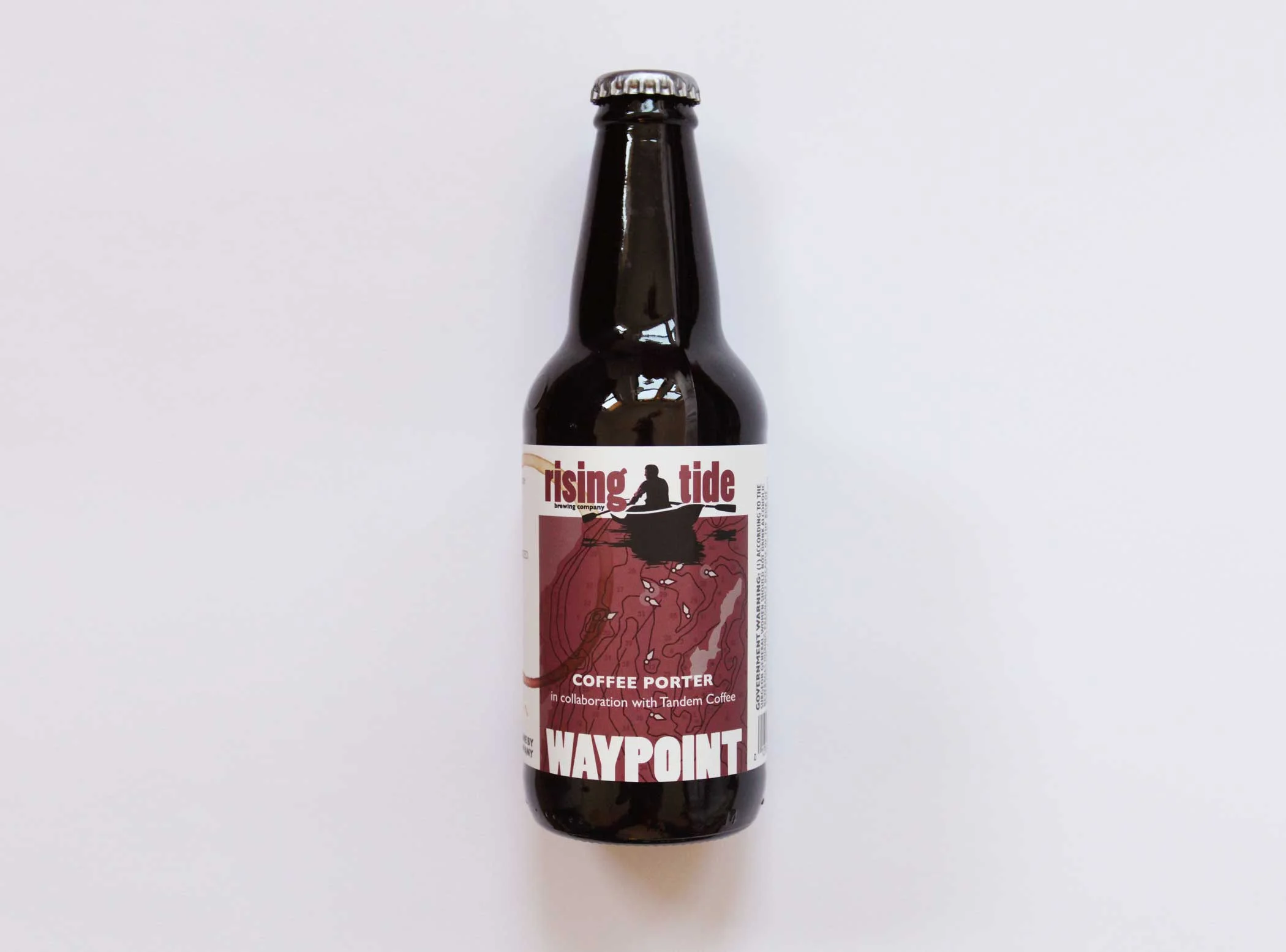
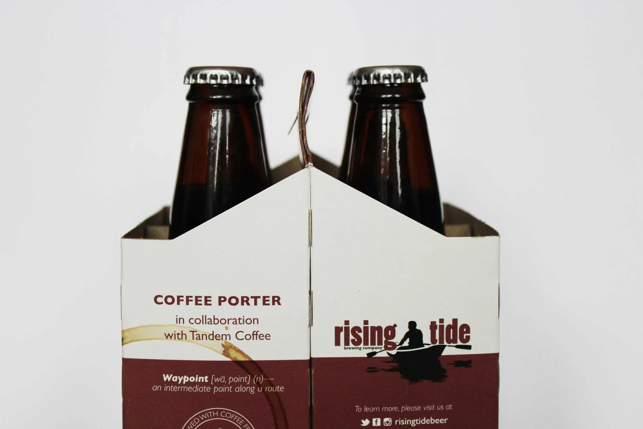
The design of Waypoint's label and four pack carrier are inspired by the markings on a nautical sea chart. The color is a nod to the flavor profile of a coffee porter. I've drank a lot of this beer and yes, it is delicious.

APPLYING BRAND GUIDELINES

Might & Main helped create a text and color based system to differentiate Rising Tide's offerings. My job as a designer is to enforce existing brand guidelines, but also push the limit to create a product that really pops. Designing for a brewery was definitely a check off the bucket list.